
Design as Satire
In this issue of The Chop, we’re going to be exploring satire in design. How design makes us laugh, how design can be used to criticize and make humorous statements, and we’ll find time to poke fun at ourselves too. Designers often have a reputation of being too serious so it’s about time we break that stereotype!
Architecture has a long history of instilling reactions in the public – Greek architecture inspired reverence, Gothic cathedrals inspired awe, Coop Himmelblau inspires confusion (at least in me), but how often does architecture inspire laughter?
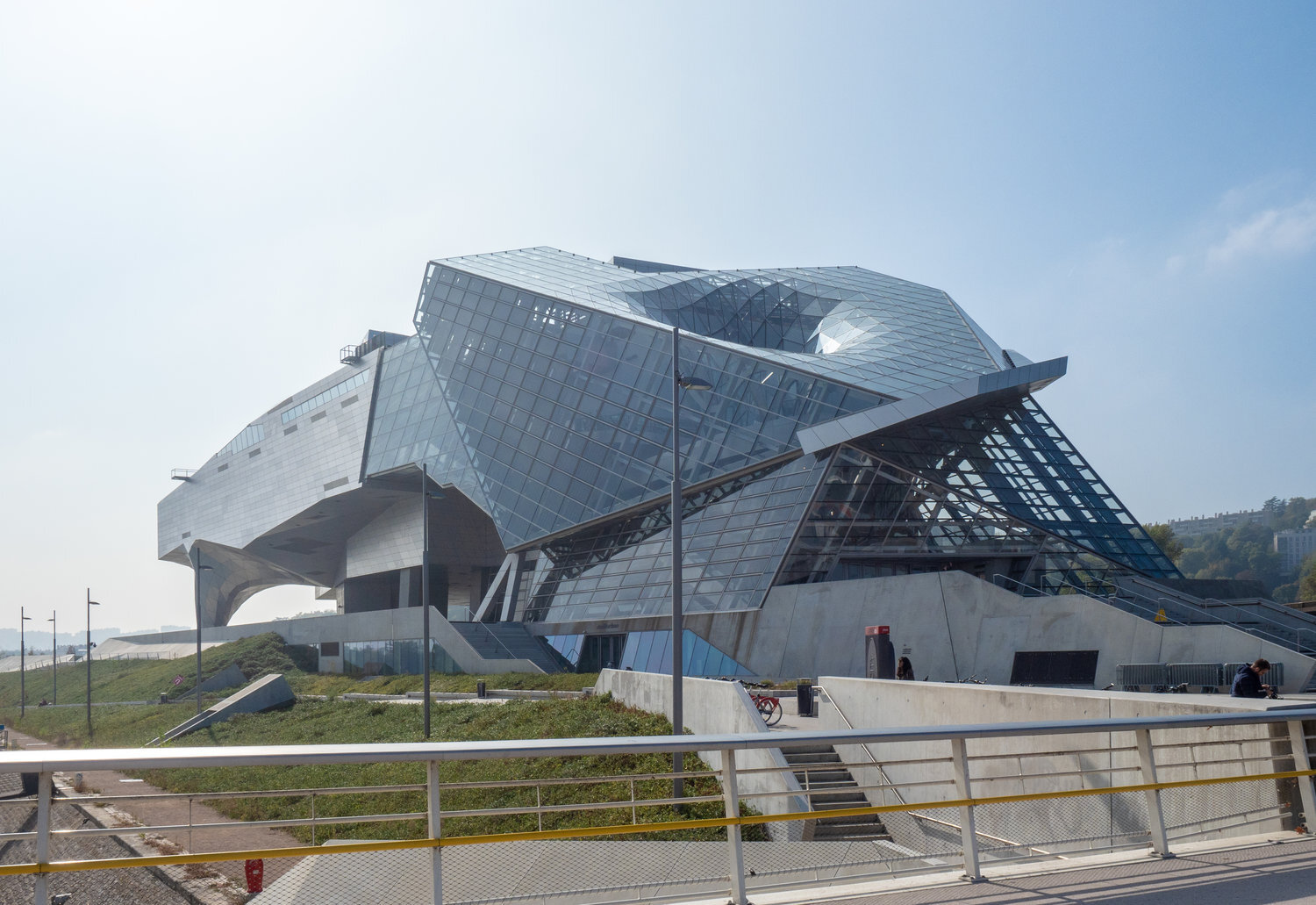
Le Musée des Confluences - Coop Himmelb(l)au. Image Source: Wikimedia Commons
One area where laughter is prevalent is when we’re laughing at architecture. That’s to say, we’re getting schadenfreude out of bad architecture. Great examples of this are McMansion Hell, who takes swings at America’s ugliest display of poor taste; Burj al Babas, the abandoned luxury development in Turkey of cookie-cutter faux-castles that’s currently sweeping the internet; and the elephant building in Bangkok, which looks like a child drew a bad picture of an elephant and then a contractor mistook it for a construction drawing.

Elephant Building, Bangkok. Image Source: Wikimedia Commons
Designers love to laugh at poor taste because we see ourselves as tastemakers. That doesn’t mean that we’re always right because taste can be subjective. And we also need to be careful that mocking poor taste doesn’t come from a place of classism or racism. But you don’t have to be a designer to audibly balk at this house:
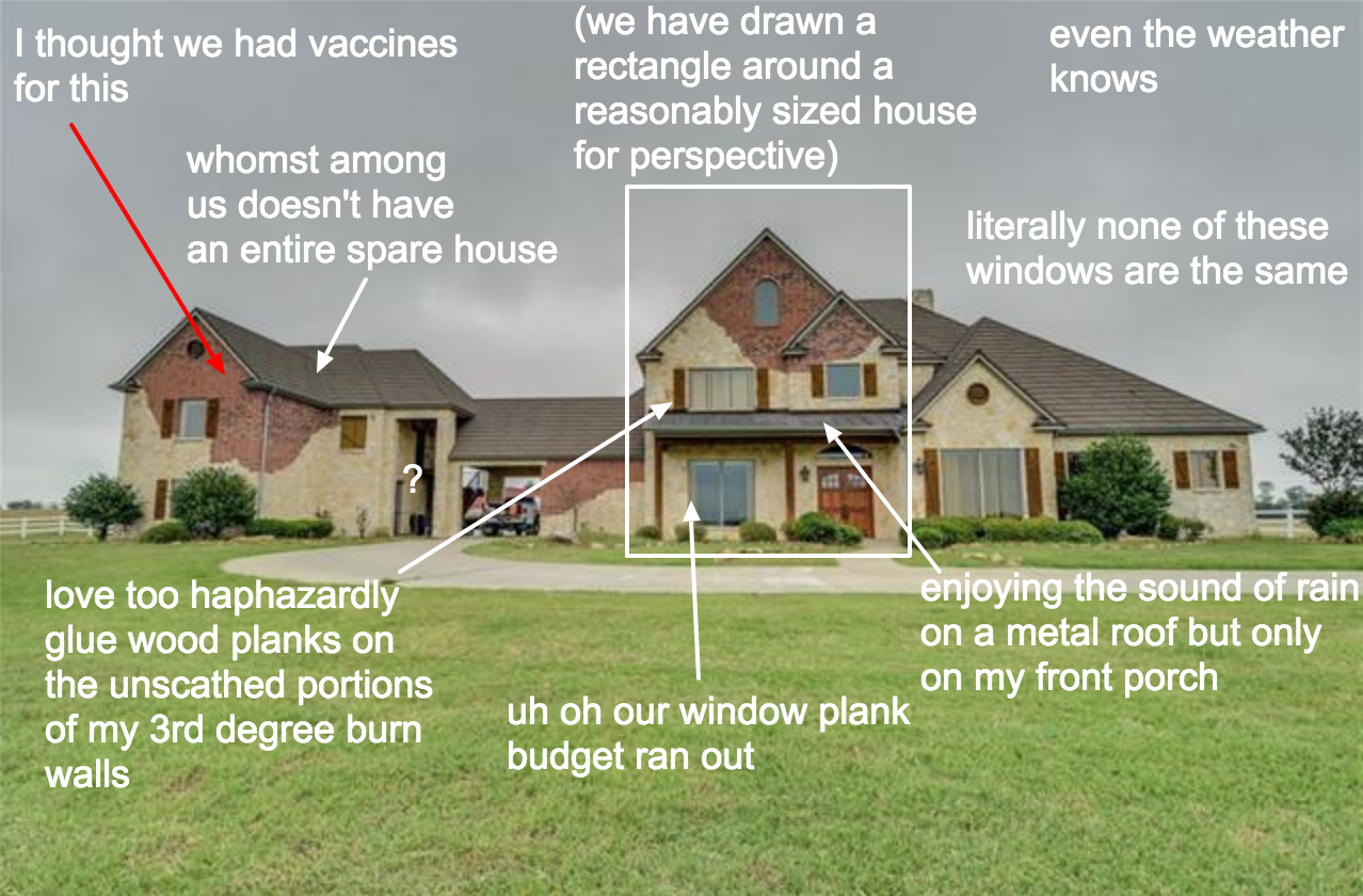
Image Source: Courtesy of McMansion Hell
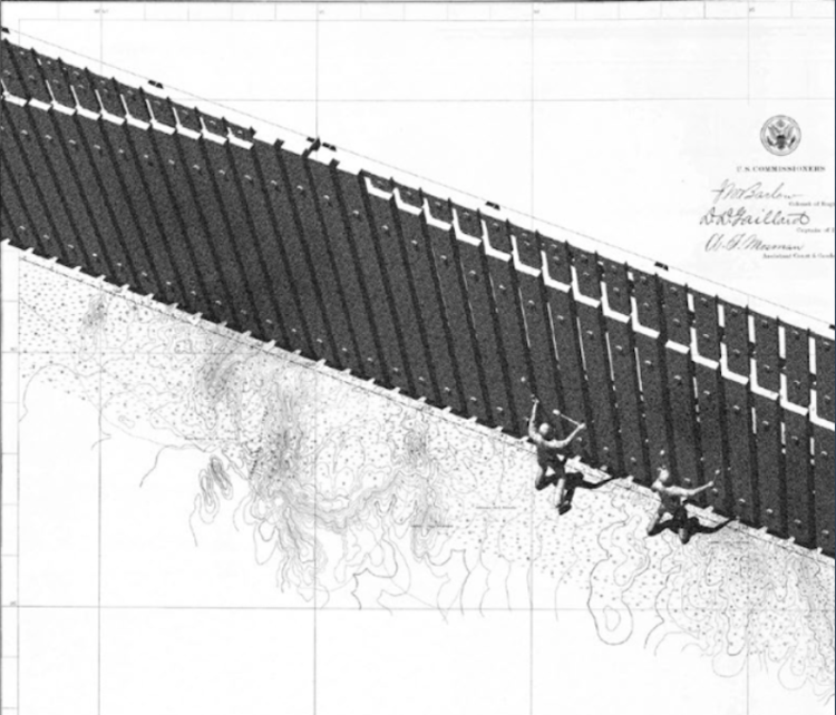
And then there’s satire as design rather than satire of design. I love to see designers using the medium as a way to criticize an aspect of society or to criticize ourselves. A great topical example of this is architect Ronald Rael’s proposals for Trump’s U.S.-Mexico border wall. When the Department of Homeland Security put out an official call for border wall designs, Rael had plenty of ideas: it could be a volleyball net where people on either side could play against each other, a see-saw where children on either side could play together, a burrito stand where one side would feed the other, or my favorite, the wall would be a giant xylophone where people could play music on it. These designs show Rael’s criticism of Trump’s case for the wall: in every design, the wall becomes a place of collaboration and congregation rather than separation.
Border Wall as Xylophone - Ronald Rael
Cover Image: Courtesy of McMansion Hell